Comfort Storage

A comprehensive brand identity for a self-storage company that evokes friendly associations and builds a welcoming brand image.
Year
2023/2024
Client
Comfort Storage
Services
Branding | Web Design | Animation
Client
Comfort Storage is a self-storage company that creates storage facilities. People can use these facilities to store their items during a move, a renovation, or simply when they don't have enough space at home. The company's main value is proximity. They operate on a convenient model, similar to the way "Żabka" functions in the convenience store market, but in the self-storage industry.
Goal
Our goal was to create a brand identity that evokes positive emotions and friendly associations. The main attributes the brand should be associated with are: easily accessible, nearby, safe, and comfortable.
About Image
Branding
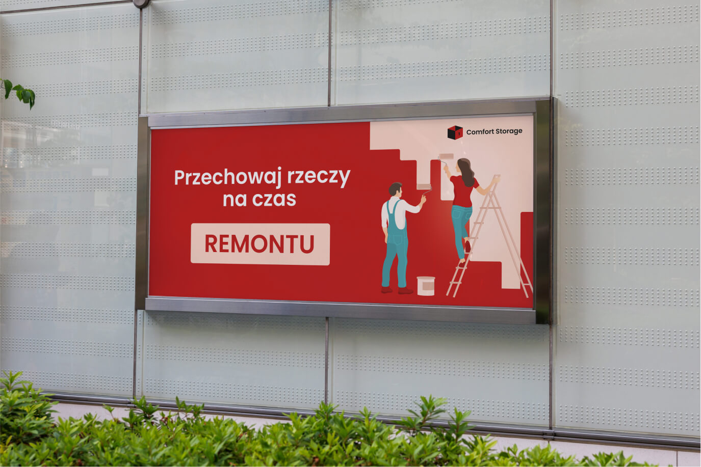
The self-storage market in Poland is still developing, and building awareness of the industry is very important. Therefore, we decided to use the color red, which is commonly associated with the self-storage industry. From the user research we conducted, it emerged that some people associate "self-storage" with a "red warehouse." We used a sans-serif font to highlight the modern character of the brand. To emphasize brand values such as easily accessible and nearby, we chose to incorporate playful illustrations into the brand's image.
About Image
Web design
One of our deliverables was the website design. Our goal was to make it easy to navigate, user-friendly, and modern. To underscore its modernity, we incorporated animations and dynamic elements.
About Image